A clean resume layout can instantly improve readability, boost professionalism, and help you pass ATS scans. Here are the exact margin, spacing, and layout rules you should follow.
When it comes to creating a job-winning resume, design matters just as much as content. A resume that looks cluttered, cramped, or poorly organized can frustrate recruiters — and lower your chances of landing interviews.
This SparkCV guide breaks down the best resume margins, line spacing, and layout rules to ensure your resume always looks crisp, modern, and easy to skim.
Why Resume Margins & Spacing Matter
Resume margins and spacing play a bigger role than most job seekers realize. Before a recruiter reads your experience or skills, they react to your layout — often in 6–7 seconds. Clean spacing instantly communicates professionalism, clarity, and confidence.
Proper margins and spacing help your resume:
- Become significantly easier to skim
- Look more organized and visually balanced
- Stay ATS-friendly, ensuring nothing gets cut off
- Highlight your most important achievements
- Create a modern, polished design that stands out
Even a strong resume can fail if the spacing looks cluttered, the text appears cramped, or the layout feels chaotic. Good formatting enhances readability and increases your chances of making a strong first impression.
Best Resume Margins
Resume margins create the white space around your content. When margins are too tight, the page looks packed and stressful to read. When they’re too wide, you waste valuable space and reduce the amount of information you can include.
Recommended Resume Margins
- Standard: 1 inch (2.54 cm) on all sides
- Minimum: 0.5 inch if you absolutely need more space
- Maximum: 1.25 inches if you want a more open, elegant layout
Never Go Below 0.5 inch
Margins smaller than 0.5 inch make the page look squeezed, unprofessional, and cluttered.
Even worse: some ATS systems struggle to read text near the page edges, increasing the chances of parsing errors.
When to Use Each Margin Size
| Margin Size | When to Use It | Benefit |
| 1 inch | Most resumes, general applications | Clean, balanced layout |
| 0.75 inch | When you need more space but want to maintain good readability | Good compromise |
| 0.5 inch | Senior-level resumes, technical resumes, or two-page resumes | Fits more content without reducing font size |
| 1.25 inch | Minimalist resumes with short experience | Cleaner, luxury-layout feel |
Choosing the right margin size depends on how much information you need to present while keeping the design clean.
Best Resume Line Spacing
Line spacing determines how much breathing room your text has. If it’s too tight, your resume looks packed and overwhelming. If it’s too wide, your resume wastes space and feels unstructured.
Recommended Line Spacing
- 1.0–1.15 for all body text
- Extra 6–12 px (around 4–8 pt) between major sections (Summary, Skills, Experience, etc.)
Why Proper Spacing Matters
- Improves readability on both screen and print
- Helps recruiters scan bullet points faster
- Creates a more modern, clean aesthetic
- Provides visual separation between sections
- Reduces eye fatigue during quick reviews
Spacing Mistakes to Avoid
- Text spaced too tightly (cramped, cluttered)
- Line spacing above 1.5 (wastes space)
- Inconsistent spacing between sections
- Large gaps that break visual flow
- Stacking bullet points with no room between them
Consistent spacing is one of the easiest ways to elevate your resume design instantly.
Ideal Resume Layout Structure (Clean & ATS-Friendly)
A clean layout is about more than aesthetics — it’s about making your information instantly scannable for both humans and ATS software. SparkCV recommends the following modern structure:
Header
Include:
- Name
- Job Title
- Phone Number
- Professional Email
- LinkedIn or Portfolio link
Formatting Tips:
- Use a slightly larger font for your name (18–24 pt)
- Keep the header simple and no more than two lines
- Avoid adding a full address — city + state is enough for U.S. resumes
Professional Summary
A short, impactful 2–3 sentence introduction highlighting:
- Your top strengths
- Years of experience
- Industry expertise
- Key achievements or value
Make this section ATS-friendly with relevant keywords.
Skills Section
Include 8–12 skills that are directly relevant to the job.
Best practices:
- Use a clean two- or three-column layout
- Separate hard skills and soft skills if necessary
- Prioritize skills from the job posting
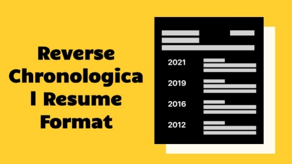
Work Experience
Use a reverse chronological structure:
Job Title | Company | Location | Dates (YYYY–YYYY)
Under each role, add 3–5 accomplishment-focused bullet points, such as:
- "Increased sales by 28% within one year through targeted outreach."
- "Reduced support ticket backlog by 45% using automated workflows."
Avoid long paragraphs — bullet points are easier to scan and more recruiter-friendly.
Education
Include:
- Degree
- Major
- University
- Graduation year (optional for senior professionals)
Optional Sections (Add Only If Relevant)
- Certifications
- Projects
- Awards
- Languages
- Technical Skills
- Volunteering
- Publications
These sections can strengthen your resume, but only include them if they add real value.
Resume Layout Best Practices for a Clean Design
A clean, professional resume layout isn’t about adding flashy elements—it’s about creating a structure that recruiters can scan in seconds and that ATS software can read without errors. Follow these layout principles to keep your resume visually balanced, modern, and easy to navigate.
1. Use consistent alignment
Left alignment is the most readable format for both recruiters and ATS systems. It creates a predictable flow of information and ensures that your resume scans correctly. Avoid mixing center alignment and justified text, which can create awkward spacing.
2. Keep bullet points short and focused
Each bullet should communicate one clear achievement or result. Short bullets improve readability and help recruiters identify your impact quickly. Aim for 1–2 lines per bullet, never full paragraphs.
3. Limit your color palette
Use a single primary color—typically blue, gray, or black—to maintain a professional look. Bright or neon colors may distract readers and can appear unprofessional in corporate settings. Minimal color use also ensures maximum compatibility with ATS parsing.
4. Use consistent font sizes
Follow a predictable hierarchy to make your resume visually structured:
- Body text: 10–12 pt
- Section headings: 14–16 pt
- Name: 18–24 pt
This hierarchy helps key information stand out naturally, without relying on excessive styling.
5. Avoid unnecessary design elements
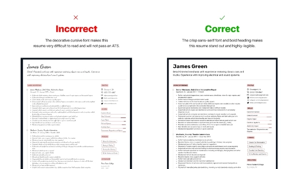
Skip graphics, icons, tables, text boxes, borders, and photos unless your country or industry specifically requires them. These elements often break ATS scanning and add clutter that reduces readability.
6. Use a single font family
Choosing one professional font family—such as Calibri, Inter, Arial, Helvetica, or Cambria—creates a polished, unified look. Avoid mixing multiple fonts, which can make the design appear inconsistent.
Examples of Clean Resume Spacing & Layout
Below are simple spacing rules you can apply immediately to achieve a well-balanced resume layout. These micro-adjustments significantly improve readability.
Section Spacing
- 6–12 px above each section header: Creates a clear separation between major sections.
- 2–4 px below section headers: Adds subtle breathing room before content begins.
- 4–6 px between bullet points: Ensures bullets don’t look crowded or cramped.
Text Spacing
- Line spacing: 1.0–1.15 for maximum clarity.
- Avoid extra blank lines or excessive padding—this wastes space and reduces overall impact.
Paragraph Structure
- Use bullet points instead of paragraphs for work experience.
- Bullets improve skimming speed and make achievements easier to digest.
- Save paragraphs for summary sections only.
Common Layout Mistakes to Avoid
These common formatting errors make resumes harder to read and can cause problems with ATS parsing:
- Margins smaller than 0.5 inch
- Using multiple font families or inconsistent font sizes
- Overusing bold, italics, underlines, or color
- Text running too close to the edges of the page
- Crowded bullet points with no spacing
- Long paragraphs instead of bullets
- Saving the resume as an image instead of a PDF
- Using overly decorative templates that break ATS scanning
A clean resume design is simple, modern, and precise—never cluttered or stylized.
ATS Requirements for Margins & Spacing
Applicant Tracking Systems (ATS) rely on clean, structured formatting to extract your information correctly. To ensure your resume passes ATS screening:
ATS-friendly resumes should be:
- Standardized
- Text-based
- Free from graphics and icons
- Consistent in spacing and alignment
Proper spacing helps ATS correctly detect:
- Section headers
- Job titles and work experience
- Dates and timelines
- Skills and keywords
Using heavily stylized templates can cause parsing errors, meaning the ATS may skip or misread your content entirely. Clean formatting improves both ATS compatibility and human readability.
Example of a Perfectly Spaced Resume (SparkCV Standard)
Here’s a simple structure you can follow to ensure a polished, modern layout:
Margins
- 1 inch (standard, recommended)
Font
- Inter, Calibri, or Arial
Font Sizes
- Name: 22 pt
- Section Headings: 15 pt
- Body Text: 11 pt
Spacing
- Line spacing: 1.15
- 10 px above major sections for clear separation
This layout is clean, professional, and fully ATS-friendly.
Final Answer: Best Resume Margins, Spacing & Layout Rules
Here is the quick summary of the optimal standards:
Best Resume Margins
- 1 inch (ideal for most resumes)
- 0.5–0.75 inch (if you need extra space but want to remain ATS-safe)
Best Line Spacing
- 1.0–1.15 for excellent readability
- Add extra spacing before section headers for visual clarity
Best Layout
- Clean and consistent
- Left-aligned
- ATS-friendly
- Logical section order
- Minimal colors
- One font family throughout
A well-spaced resume not only looks more professional—it also makes your achievements stand out and significantly improves your chances of passing both ATS and recruiter screening.
Format Your Resume Automatically With SparkCV
Manually adjusting margins, spacing, and alignment can be time-consuming. SparkCV’s AI-powered Resume Builder handles everything for you automatically.
With SparkCV, you can:
- Use clean, ATS-optimized templates
- Instantly apply perfect margins and spacing
- Choose modern, recruiter-approved fonts
- Generate resume content with AI
- Download your resume in PDF or DOCX
- Create a matching cover letter in seconds
Build a polished, professional resume in minutes — no formatting required.