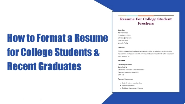
Choosing the right font size and font style for your resume plays a major role in how recruiters perceive you. Even with strong experience, a poorly formatted resume can look unprofessional or become unreadable by Applicant Tracking Systems (ATS).
This guide covers the best resume fonts, the ideal font sizes, spacing rules, what to avoid, and examples you can copy.
Why Resume Font Size & Style Matter
Your resume is usually scanned in less than 7 seconds, either by a recruiter or an Applicant Tracking System (ATS). In that short time, the typography you choose directly affects how easily your information can be read and how professional your application appears.
The right font size and style determine:
- Readability – whether your text is easy on the eyes
- Professional appearance – clean, polished fonts signal credibility
- ATS compatibility – simple, standard fonts ensure your resume is parsed correctly
- Visual hierarchy – fonts help guide the reader’s eyes through sections
- First impression – poor typography can make a great candidate look unprofessional
Using the wrong resume font style — such as cursive, decorative, or overly stylized typefaces — can instantly ruin readability. Likewise, using text that’s too small forces the reader to strain their eyes, causing your resume to be skimmed or dismissed before anyone reaches your qualifications. Proper typography is a small detail, but it has a huge impact on your resume’s effectiveness.
Best Font Size for a Resume (2025 Standards)
Choosing the correct resume font size ensures your document looks polished, readable, and balanced. Below are the recommended sizes for every element of your resume according to 2025 formatting standards.
Body Text
10–12 pt
This range provides the highest readability on both digital screens and printed copies. It’s also the size most hiring managers expect.
Section Headings
14–16 pt
Section titles should stand out clearly from the body text without looking oversized or distracting. Larger headers improve visual navigation and make your resume easier to skim.
Applicant Name (Header)
18–24 pt
Your name should be the most prominent text on the page. It acts as your personal brand marker, so slightly larger text is appropriate and expected.
Subheadings (Job Titles, Company Names)
12–14 pt
These serve as secondary elements and should be more visible than body text but smaller than section headings.
Font Size Mistakes to Avoid
- Body text smaller than 10 pt (too difficult to read)
- Unbalanced or inconsistent header sizes
- Oversized text that makes your resume look unprofessional or like filler
- Using more than 2–3 font sizes in total
Using proper sizing creates a resume that looks structured, modern, and hiring-manager-friendly.
Best Font Styles for Resumes (ATS-Friendly Options)
Not all fonts are created equal. Some are highly readable and optimized for both ATS and human scanning, while others can break your layout or reduce clarity.
Below are the best resume font styles recommended by HR professionals, recruiters, and major ATS providers.
Top Sans-Serif Resume Fonts
Clean, modern, and ideal for digital resumes.
- Arial
- Helvetica
- Calibri
- Inter
- Verdana
Sans-serif fonts are excellent for readability on screens and provide a sleek, contemporary look.
Top Serif Resume Fonts
Professional and great for formal applications.
- Cambria
- Georgia
- Times New Roman (traditional but still acceptable)
Serif fonts are often preferred for roles in academia, law, government, and executive-level positions.
These fonts work well because they balance professionalism with high readability — two things ATS scoring algorithms prioritize.
Fonts You Should Avoid on a Resume
Some fonts may appear stylish or expressive, but they hurt clarity and reduce your chances of passing ATS scans. Avoid these at all costs:
- Comic Sans – looks childish and unprofessional
- Courier New – outdated typewriter vibe
- Papyrus / Script / Bradley Hand – decorative and hard to read
- Cursive or handwritten fonts – ATS cannot interpret them
- Any font with heavy styling, shadows, or extreme thickness
Decorative fonts tend to distract the reader and reduce scanning efficiency — something you absolutely don’t want on a resume.
Best Resume Font Combinations (Safe & Professional)
If your resume uses more than one font, choosing combinations that complement each other is essential. Here are some SparkCV-approved pairings used by modern resume templates:
Combination 1 — Modern & Clean
- Name/Header: Helvetica Bold, 20 pt
- Body: Helvetica Regular, 11 pt
Combination 2 — ATS-Optimized
- Headings: Calibri SemiBold, 15 pt
- Body: Calibri Regular, 11 pt
Combination 3 — Elegant & Traditional
- Headings: Georgia Bold, 16 pt
- Body: Georgia Regular, 11 pt
Combination 4 — Ideal for Tech/Startup Roles
- Headings: Inter Bold, 16 pt
- Body: Inter Regular, 11 pt
These combinations blend readability, professionalism, and modern design.
Line Spacing & Margins (Often Overlooked but Crucial)
Even the most carefully chosen fonts and sizes won’t look good without proper spacing.
Recommended Line Spacing
1.0–1.15
This range keeps your resume easy to read without leaving awkward gaps.
Spacing Between Sections
6–12 px
Adding space differentiates sections and improves visual flow.
Standard Resume Margins
- 1 inch (ideal)
- 0.5 inch (minimum) if you need extra space
Proper spacing prevents text from feeling cramped, which significantly improves readability and keeps your resume looking clean and organized.
Example: Perfect Typography Setup for a Resume
Here’s a ready-to-use typography system that works for almost any profession:
- Name: Inter Bold, 22 pt
- Section Headings: Inter SemiBold, 15 pt
- Body Text: Inter Regular, 11 pt
- Line Spacing: 1.15
- Margins: 1 inch
This setup is fully ATS-friendly, easy to read, and visually modern — ideal for 2025 job applications.
Common Font Mistakes to Avoid
Many job seekers underestimate how much typography influences readability and overall professionalism. Even small font errors can make your resume look cluttered, amateurish, or difficult for ATS to read. Here are the most common mistakes to avoid — and why they matter:
Using more than 1–2 fonts: Mixing several typefaces makes your resume visually inconsistent and harder to scan. Stick to a single font family or a clean, compatible pair.
- Using ALL CAPS for entire sections: All caps reduce readability and appear overly aggressive. Use them sparingly — for small labels only, never full paragraphs.
- Excessive bold, italics, and underlines: Over-formatting makes your text look busy and distracts the reader from key information. Reserve bold text for job titles or section headers only.
- Bright or distracting font colors: Neon or unconventional colors hurt readability and look unprofessional. Black or dark gray is the safest choice.
- Shrinking text to squeeze in more content: Tiny text is hard to read on both screens and printed pages. If you’re running out of space, edit your content — don’t reduce the font size.
- Overusing serif fonts for junior or creative roles: Serif fonts can appear formal or academic. For entry-level, marketing, or tech positions, clean sans-serif fonts typically perform better.
Remember: Your typography should support your message — not compete with it.
The Best Resume Font Style for ATS Systems
Applicant Tracking Systems (ATS) rely on predictable letter shapes, standard spacing, and clean digital rendering. When you choose the right font, you ensure the ATS reads your resume correctly — increasing your chances of landing an interview.
ATS-friendly fonts share these characteristics:
- Standard and widely available on all devices
- Simple and easy-to-render letterforms
- No decorative elements or irregular spacing
- High clarity at smaller sizes (10–12 pt)
Best ATS-Compatible Resume Fonts:
- Arial — clean, modern, and highly readable
- Calibri — Microsoft default, designed for screens
- Helvetica — premium clarity (especially for design/tech roles)
- Cambria — professional serif font optimized for digital text
- Georgia — elegant but still ATS-safe
- Times New Roman — traditional but acceptable
- Inter — modern web-safe font used by startups and tech companies
Fonts to Avoid for ATS:
- Decorative scripts
- Handwriting styles
- Slanted or ultra-light fonts
- Compressed or stylized display fonts
ATS may misinterpret these, causing broken text, missing characters, or unreadable job titles.
Final Answer: Best Font Size and Font Style for Resume
Here’s a quick, clear summary of the best practices when formatting your resume typography:
Best Resume Font Styles (Professional & ATS-Friendly)
- Arial
- Calibri
- Helvetica
- Cambria
- Inter
- Georgia
Best Resume Font Sizes
- Body Text: 10–12 pt
- Section Headings: 14–16 pt
- Name (Header): 18–24 pt
- Subheadings: 12–14 pt
Essential Rules to Follow
- Keep fonts simple, modern, and easy to read
- Avoid decorative, script, or cursive fonts
- Stick to a single font family for a unified look
- Use consistent formatting across all sections
- Ensure spacing and margins enhance readability
- Always format for ATS compatibility
Using clean, well-structured typography gives your resume a professional, polished appearance — helping you stand out from other applicants and improving your chances of being noticed by recruiters.
Format Your Resume Instantly With SparkCV
If you don’t want to worry about choosing fonts, matching sizes, or adjusting spacing manually, SparkCV can do everything for you.
With SparkCV, you can:
- Use professionally pre-formatted, ATS-approved resume templates
- Choose clean, recruiter-preferred font styles
- Ensure flawless spacing, margins, and layout
- Export instantly to PDF or DOCX
- Generate resume content automatically with AI
- Create matching, professionally designed cover letters
Build a perfectly formatted resume in minutes — no design skills needed.