Looking Back at the Journey of the Windows Logo: Unforgettable Milestones

Ngoc Phuong
2024-08-18 . 348 view
We’ve all used Windows, the most widely used operating system in the world. But have you ever wondered how the Windows logo we see every day has changed over time? From simple window panes to colorful waving flags, the Windows logo has been a constant companion throughout the development of computer technology. Let’s explore the fascinating history behind these symbols.
Before we embark on this journey back in time, it’s important to note that there have been dozens of small variations of the Windows logo used in print, advertising, software, retail packaging, and more—too many to detail. Therefore, we will focus on the main designs that Microsoft has used for the Windows logo over time.
The Grid-Like Window Logo: 1985-1989
Initially, Windows almost didn’t have a logo. The image on the product box, welcome screen, and advertisements for Windows 1.0 (1985) and 2.0 (1987) often featured just the words "Microsoft Windows" without any accompanying symbol. However, in the years that followed, Microsoft introduced a rarely used logo for Windows 1.x and 2.x with an asymmetrical four-pane design, reminiscent of the many windowed tiles in Windows 1.0 that filled the screen without overlapping.
In a 2012 blog post, Microsoft developer Sam Moreau described this design as the "original Windows logo," but in reality, it was seldom used at the time. It was used in conjunction with the Microsoft Windows Development Seminar held in 1986 and 1987—and a limited-edition boxed version of Windows distributed at the event. Nevertheless, it laid the groundwork for future logos.
![]()
The Window Logo: 1990-1991
Like Windows 1.x and 2.x, Windows 3.0 (1990) primarily used a wordmark logo. "With Windows 3.0, there was no standard Windows logo," said Brad Silverberg, Microsoft’s vice president in charge of Windows at the time. "Each marketing group, sales group, or sales event made its own logo. Sometimes a logo was reused, but there was no standard."
Some retail boxes of Windows also used a black-and-white gradient window illustration on certain products to signify compatibility with Windows 3.0. This motif, which resembled a window, has remained associated with Windows in various forms to this day.
![]()
The Flag Logo: 1990-1993
Windows 3.1 refreshed things in 1992 by introducing a vibrant logo that took the window motif and transformed it into a waving flag with a trailing streak. The four colors (red, green, blue, and yellow) filled the panes of this flag window, while the trailing streak broke into small blocks, perhaps suggesting digital information units.
Former Microsoft Vice President Brad Silverberg recounted the origin of this flag logo: "I felt it was a missed opportunity not to have a standard Windows logo in the 3.0 era, so we needed to create a new logo and mandate its use everywhere. I directed the system marketing team to develop a new logo. They worked with some external designers, presented the final ideas to me, and I chose the Windows flag that has now become iconic. It’s still my favorite design. It set up good colors, overall design, had a sense of motion, and lasted for decades. I wanted to build a logo with lasting value, and I succeeded!"
![]()
Microsoft also used this flag logo with Windows NT 3.1 (the first NT version) the following year.
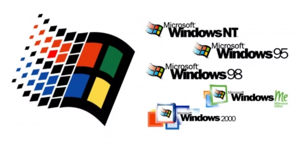
The Flying Flag: 1994-2000
In 1994, Microsoft designers gave the Windows 3.1 flag logo a fresh twist by tilting it slightly clockwise, suggesting a company always on the move. This new logo first appeared with Windows NT 3.5 in 1994 but soon made its way to Windows 95, Windows NT 4.0 (1996), Windows CE (1996), Windows 98, Windows Me (2000), and Windows 2000 in various forms.
Notably, for the Me and 2000 logos, Microsoft added some square window elements around the flying flag for a more modern look.
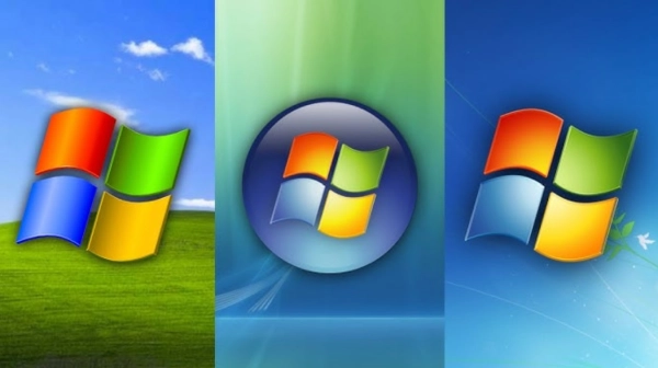
The Simplified Flag: 2001-2011
With Windows XP in 2001, Microsoft streamlined the waving flag into four simple colored panes fluttering in the wind. The same colors were retained, but the black outline disappeared. With Windows Vista (2006), Microsoft gave the simplified flag a new color gradient and often placed it in a bubble.
Windows 7 (2009) continued the Vista tradition, and Windows Phone 7 (2010) used a white version of the simplified flag placed within bubbles or squares.
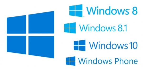
The Tilted Window: 2012-2020
With Windows 8 (2012), Microsoft returned to the simple window logo, abandoning the flag-like design of the past and once again making the four panes resemble a house window, but this time tilted at an angle. The simple design of the new logo also reflected the "Metro" interface of Windows 8, which featured app tiles instead of icons.
The new angled window logo also appeared in Windows RT (2012), Windows Phone 8 (2012), some versions of Windows Embedded Compact, Windows 8.1 (2013), and Windows 10 (2015). However, there were some variations in angle and pane size between different versions.
The Grid Design: 2021-Present
Microsoft released Windows 11 in 2021. For the logo of the current Windows version, Microsoft removed the tilt and opted for a simple design of four blue squares. In fact, it was inspired by the Microsoft logo (first introduced in 2012), which has the same shape but with the four traditional Windows colors (red, green, blue, yellow).
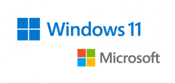
Vincent Joris, Windows brand director, said, "We looked at the Microsoft logo and turned it into blue, which is the color people most associate with Windows."
The new logo reflects the design of Windows 11 while retaining the famous four-pane window motif that has been used for at least 22 years. Perhaps as long as the Windows operating system exists, there will always be a window somewhere in its logo.
Ngoc Phuong
Web Developer
Thank you for visiting my website. My name is Ngoc Phuong, and I have over 10 years of experience in website development. I am confident in stating that I am an expert in creating impressive and effective websites. If you need a website designed, please feel free to contact me via email at [email protected].
Submit feedback
Your email address will not be made public. Fields marked are required *
Search
Trend
-
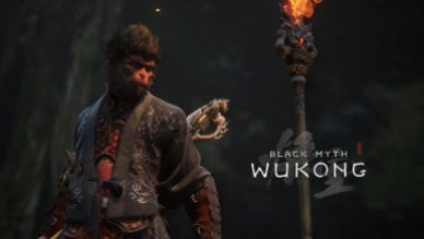
What is Black Myth: Wukong? Detailed Guide on System Requirements and Gameplay
08-21-2024 . 1k view
-

The simplest and fastest way to log into the Chinese TikTok, Douyin.
01-10-2022 . 1k view
-

Blog sites that will accept AI generated content
07-26-2024 . 1k view
-
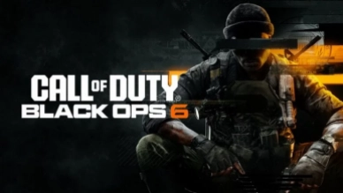
Call of Duty: Black Ops 6 - Intense, Mysterious, and Surprising Warfare
09-02-2024 . 1k view
-
The "End of Life" for Windows 10: A Massive E-Waste Threat and Sustainable Solutions
08-18-2024 . 943 view
0 feedback